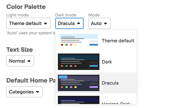
I discovered there is a possibility to set a dark theme, to comfortably see in the dark without hurting vision. However, I noticed the theme has some gaps, some controls are still white, the text color seems to pale as well, without contrast.
I don’t know how themes are handled, maybe users an contribute in this area ?
Also I noticed that other discuss have other “palettes”, so maybe that’s something to look into ?


